
Designing for the smart TV is governed by a set of strict and unforgiving rules. Failing to follow them may result in developing an unusable app at best, and a losing business at worst. The idiosyncrasies of the TV screen and the way we use it make it impossible to simply copy and paste the tried-and-tested desktop design patterns.
In this article, we’ll discuss the key things that should be kept in mind when designing smart TV interfaces, and why not following them can ruin your app.
Design with the living room in mind
The fact that the TV is almost always located in the living room means two things:
- The room is very bright during the day,
- The room can get pitch-dark in the evening,
- The sofa can be placed anywhere between one to 10 meters from the screen.
But why are these things important from the UX perspective and what to do about it?
Direct sunlight and reflections can kill legibility. Use contrast to your advantage when designing the app. Make sure the interface is legible from many different angles and ideally test the app with different screen technologies and in different lighting conditions.
When choosing the colour palette for your app, consider the expected lighting of the living room, both in daylight and when the lights are off. Extremely high contrast won’t work. A white background will very likely kill your OLED, but even more so, it can make you blind when the room is very dark. It’s not without reason that most popular streaming apps use interfaces with dark backgrounds and rarely use whites in excess.
Mind the screen size
Unlike in laptops and desktop computers, TV screen sizes can wildly differ. This has to be taken into account when designing the interface – the fonts and elements of the interface must remain legible from a meter away as well as from four meters away.
Most bingers sit about 3 metres away from the screen. Fonts, images and other interface elements must be rigorously tested for legibility with this distance in mind. At the same time, a bigger screen should not be understood as simply more real estate to put text on – film synopsis, details and cast. Quite the contrary – make sure the design is clean, and meticulously shave off redundant elements to create a clean, minimal interface.
Design tip:
- The less the better. Screen size should not fool you. When designing a smart TV app, thinking in mobile phone rather than desktop terms.
Colors
Because the image on the TV screen is watched from a bigger distance, the interface must use higher contrast than it would normally do on a computer screen. However, because colors on TV seem more saturated, brighter, and vibrant, using too bright colors in the interface can be very tiring for the eyes, especially when high-contrast colors are watched in a dark room. Use more subdued, cool colors to make sure you don’t give your audience the unnecessary headache.
If unsure, test it using an actual TV set – your designs may not translate from the PC monitor into the big screen as well as you think they do. Also, remember that TVs use different display technologies, and using too many white elements that rarely change may lead to a burn-in in AMOLED screeds.
Overscan
Many modern TVs automatically apply overscan when displaying content. It’s not necessarily a bad thing in itself as the process allows you to fill up the screen edge-to-edge with picture. However, it can lead to the edges of the image getting chopped off.
Google Android TV, Apple tvOS and Amazon Fire TV have different overscan guidelines, but they generally revolve around the 5% margin.
Design tips:
- For Apple tvOS the recommendation is 60px X 90px distance from the sides.
- If you want to use a custom font, make sure they are legible at a distance.
- According to Google and Amazon Fire TV recommendations smart TV app designs should stay away from the 5% margin to avoid falling in the overscan area. This translates into a minimum of 27 pixels from the top and bottom, and a minimum of 48 pixels from the right and left edges.
Custom typefaces are supported by most TVs, but can be tough to read at a distance, especially if they’re too thin. Unless your app has a compelling need for a custom font, such as for branding purposes or to create an immersive gaming experience, stick with the system fonts. If you do use a custom font, make sure it’s readable from across the room.
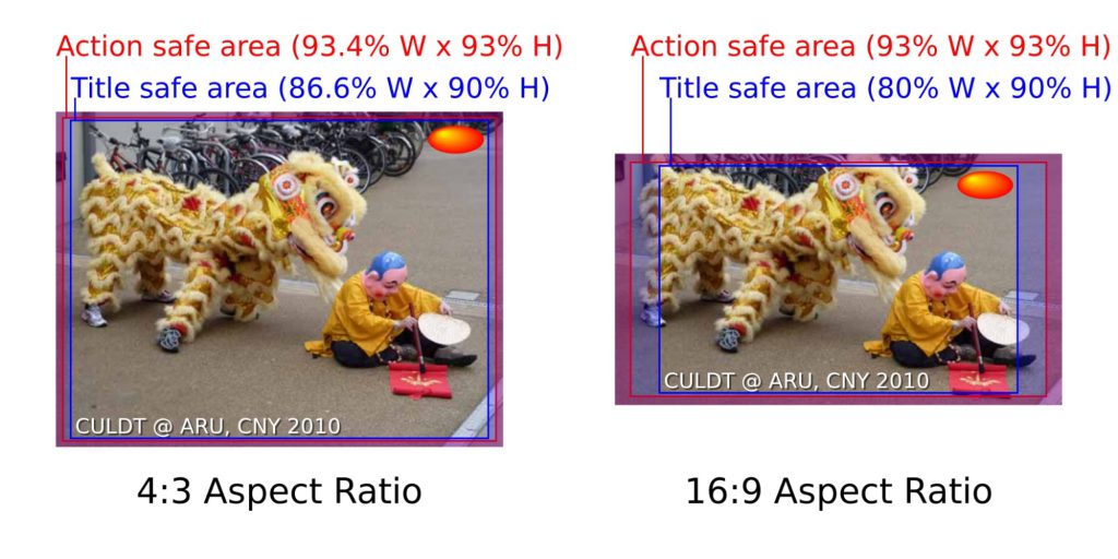
Overscan examples for 4:3 and 16:9 aspect ratios. Source: Wikipedia.
Navigation and the use of d-pad
Smart TV navigation should be designed to offer the shortest possible path to content. This basically means applications should not make the user go through numerous screens before reaching the desired content. At the same time, every screen should follow a consistent design and be simple to operate with an input device.
TV manufacturers are going out of their ways to come up with new, more intuitive, and innovative remote control devices. Gone are the days when remote controls were just dull, rectangular blocks of plastic with dozens of mysterious rubber buttons on top. Today’s remotes are more intuitive and pretty minimalistic. However, all smart TVs invariably have one thing in common: there is always a D-pad with the “OK” and “back” buttons.

No matter the controller, the d-pad is almost always there. Image source: Google.
Design tips
- Most users expect these “standard” buttons to work the same way in each app. To save users confusion, make sure your UX design complies with this expectation.
- Try to make the best use of these buttons, especially when you are developing a cross-platform app.
Over the years of using TVs, people have become used to specific UI patterns – reinventing the wheel can backfire. For example, no manufacturer has ever dared to ditch the d-pad. There have been attempts to enrich the remote with additional features like adding touch-sensitive d-pads for swiping and touch gestures.

LG’s Magic Remote may look bare bones, but the d-pad remains (source: LG)
Navigating on a smart TV should be as easy as possible. Remember that users will navigate the app without a touchscreen. Design your layout with this in mind by taking advantage of the d-pad.
Design tips:
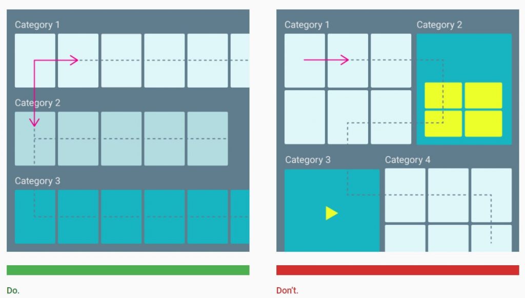
- The typical design patterns in streaming apps follow the rule that categories are browsed by going up and down, and items within each category are browsed horizontally.
- Avoid complex, confusing layout hierarchies.
Focus state
Because there is no mouse cursor or touch input on the Smart TV screen, the interface must also implement something known as the focus state – at all times, it must be made clear to the user which element is currently in focus, usually by highlighting the element or adding a different-colored border around it (see example below).
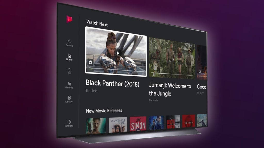
An example focus state implementation from Google Movies (white frame around the thumbnail and darkened non-focus state elements). Source.
Design tips:
- Give user visual feedback on focus changes by displaying a transition between focused and non-focused states.
- Use different sounds to provide audio feedback when focus is changed, and an action is selected.
Text input methods
Unless it’s absolutely necessary, don’t make your users type too much. Using the mushy, unresponsive TV remote buttons is something everyone prefers to avoid.
Smart TVs have a handful of possibilities to enable text input, but none are as convenient as simply typing on a physical keyboard. The super-clumsy virtual keyboards and remote control D-pad combo has become the de-facto gold standard for text input on smart TVs. But they’re far from perfect – they’re complicated, time consuming and nauseously inconvenient.
If you really require the user to input something, make it as easy as possible for the user. For example, it can be done by showing the user word suggestions that guess the film titles before they even realize what it was they were looking for (Netflix does an outstanding job here).

Netflix search engine hardly ever misses (source: Netflix)
However, if you’re not a multi-billion streaming company and designing an industry-leading machine learning algorithm is not an option (for now), start slow and offer an alternative. To save your users the hassle of entering passwords by pressing the tiny rubber buttons of the remote, offer an external login process – allow the user to use the mobile phone (like YouTube does through the https://www.youtube.com/activate site). But first and foremost, make sure the system remembers usernames and passwords and minimize how often the user needs to type anything in the first place.
Many of today’s smart TV manufacturers allow the user to speak directly into the remote control and use it as an input method. This may not be supported by certain devices and there is a higher risk of errors, but it’s definitely something users will increasingly expect from a smart TV.
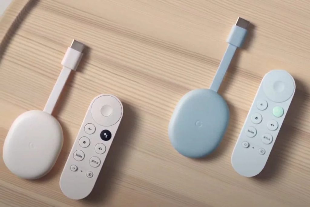
The newest-gen Google Chromecast TV has a dedicated button for Google Assistant. Source: Google.
When deciding to allow your user to use a virtual keyboard, there is another important design choice to make: use the native keyboard of the specific device or come up with your own keyboard design and layout. By choosing the latter you can ensure the keyboard looks the same no matter the device the user uses to access your app (laptop, smart TV, mobile phone).
When in doubt, follow device manufacturer’s guidelines
Almost every platform has its own specific patterns and design guidelines which must be followed to ensure that your application is accepted and certified to be on an app store. The good news is manufacturers share many design principles between them.
Many of these principles are hard to disagree with. For example: don’t present all the information at once. Google recommends that your app should show the most important and necessary information by default and, to avoid content overload, more content should only be revealed with scrolling or progressive disclosure.
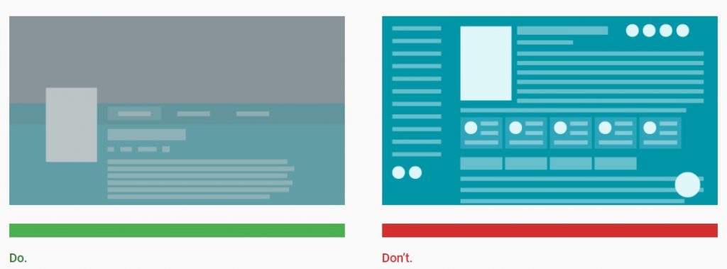
Content overload is never a good thing, but it’s especially overwhelming on big screens. Source: Google.
Last words
Content producers and media companies are heavily investing to make sure their smart TV applications. The design and performance of the app can make or break its success. In the increasingly competitive streaming industry, there is just no space for poorly designed and badly performing apps.
Bad design fails to engage users and has a bad effect on the brand’s image. Properly designing and testing TV apps is a big deal and shouldn’t be overlooked – successful apps need exhaustive test cases for all smart TV platforms.
If you’re in the process of building a smart TV app or are considering developing one, shoot us an email – we’re always willing to talk! Our experts will offer a free consultation of your project.
If you find this article valuable, you can share it on social media →
Read more about the UX/UI subject!

The Importance of UX in HbbTV app development
HbbTV plays a significant role in the interactiveness and content enrichement. Care for UX makes it shine, but why?
LightningJS takes the development world by storm, but why?
The pursuit of discovering new, powerful tools lead to the rise of Lightning JS. What are the benefits of this popular TV app framework?
OTT app creation – how to deliver amazing viewing experiences
It is easy to fall for the branding and advertising so let’s dive into crucial topics for delivering exquisite viewing experiences with every OTT…
Are you looking for a company, that will help you build a TV app?
Leave your email and a short description about your project. We would gladly discuss different cooperation possibilities!